Red, Green or Orange? Choosing an IBO Glass 43 for your brand
A quick, honest guide to picking between the three IBO Glass 43 colourways — with a real screenshot of each and who each one suits.
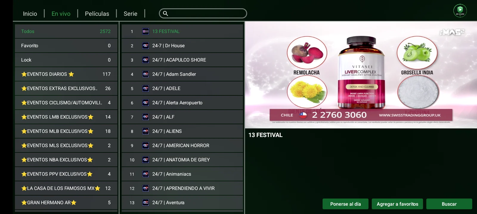
Three colours of IBO Glass 43 are up in the catalogue, and they are identical inside. The only decision is the colour your customers will look at every day. Here is a short, honest guide.
Everything below is a real screenshot of the app running on a phone.
Red — high contrast, hard to miss
Red is the boldest option. On the movie and series grids the red rating badges and the red sort selector stand out against the poster artwork, and the focus outline is easy to follow on a TV from across the room.
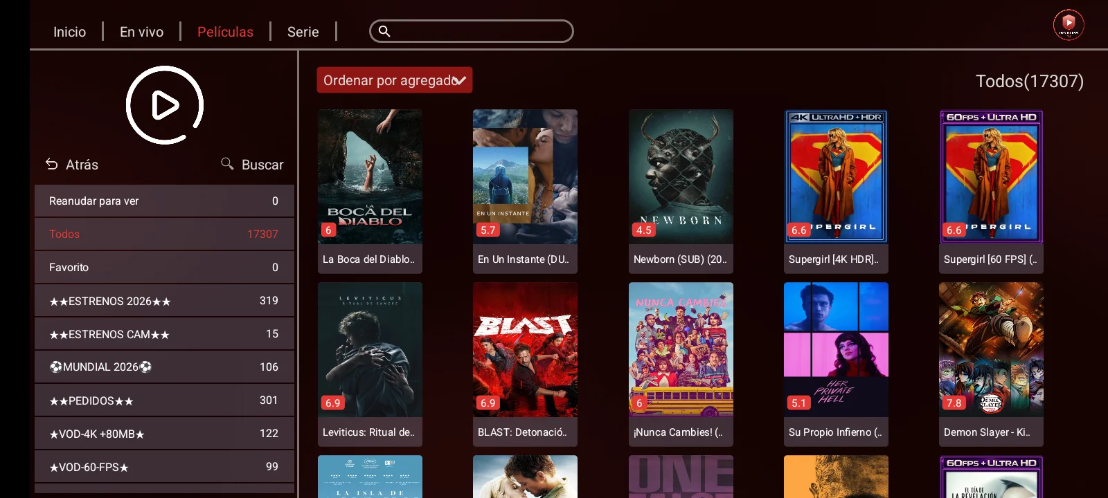
Choose red if your brand is already red, or if you want an app that feels energetic and grabs attention on a shop TV.
Green — calm behind the content
Green is the most restrained. The dark green background stays out of the way of poster art and live thumbnails, which makes long browsing sessions comfortable.
Choose green if your brand leans green, or if you simply want the quietest, most premium feel of the three.
Orange — warm and distinctive
Orange is the one people remember. It is warm without turning muddy, and because few IPTV apps use it, it stands apart in a crowded market.
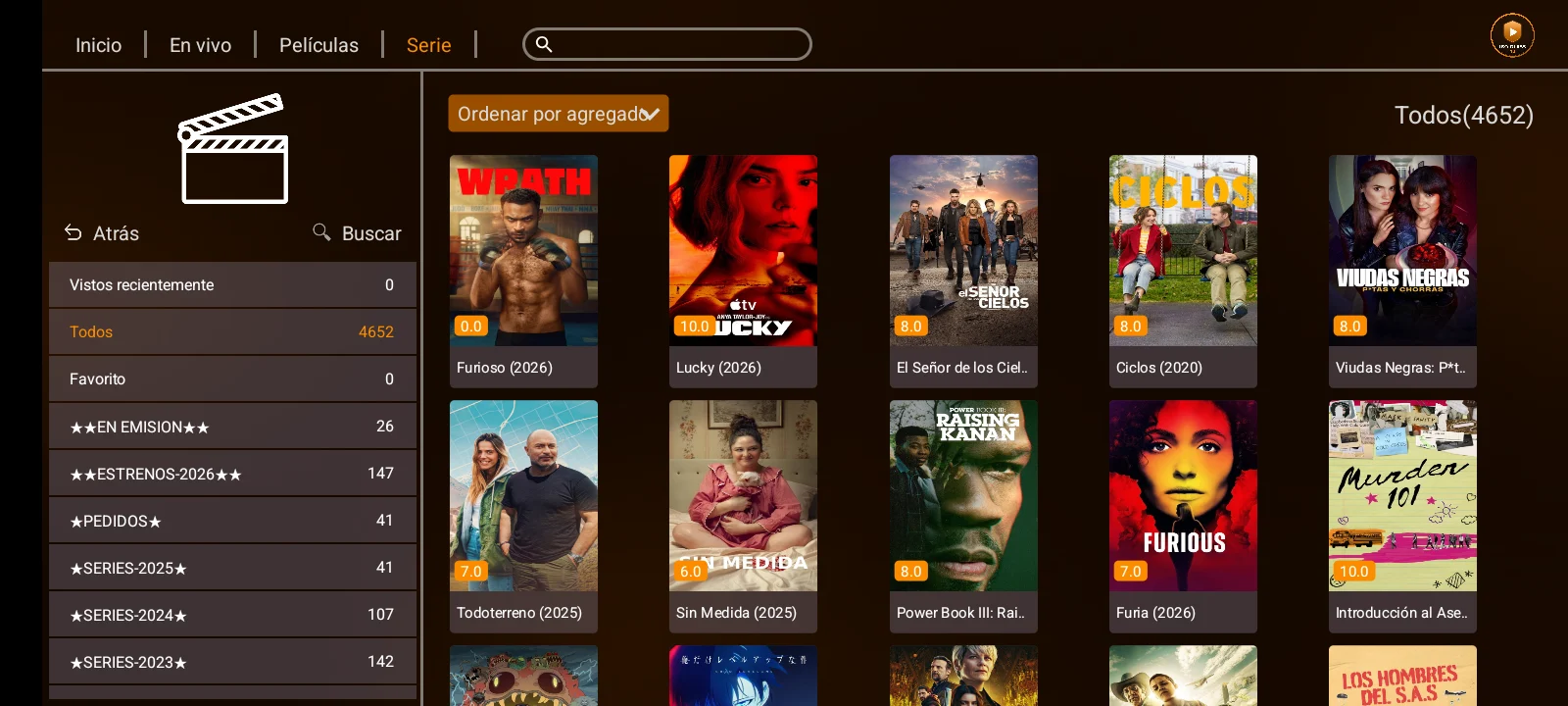
Choose orange if you want to look different from every blue-and-purple player out there.
They are all the same app
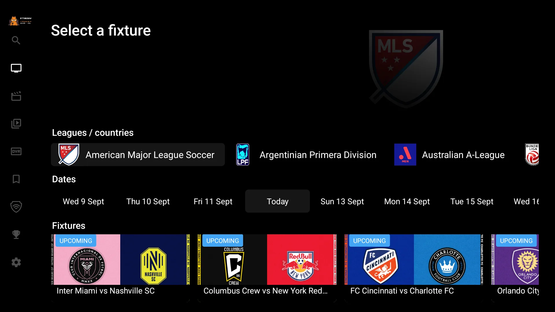
No matter which you pick, you get the same feature set: activation-code and user/password login, live TV, EPG, movies, series, Multi-Screen, VPN and parental control, in 22 languages. Install two or three side by side and decide with your own eyes — each is a separate build.
See all three on the catalogue.